commnad palette

Components

A comprehensive collection of CSS components to help you create stunning web designs with ease. Explore a wide range of ready-to-use elements like image hover effects, animated buttons, text highlights, card transitions, and more. Each component comes with live previews and clean, copy-paste CSS code, making it simple to enhance your site’s interactivity and visual appeal in seconds.

animated gradient button
A bold and visually dynamic call-to-action button featuring a smooth, animated gradient that shifts colours continuously or on hover. Designed to capture attention and increase clicks, this button is ideal for lead generation, sales funnels, or email sign-ups. Built with HTML, CSS, and a touch of JavaScript (if needed), the animation is fully customizable—adjust the gradient direction, speed, colour palette, and hover behaviour to match your brand. Works flawlessly inside Systeme.io using the custom code block.
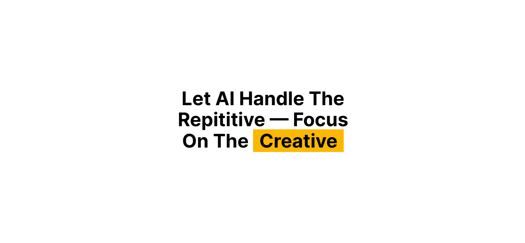
text highlight
text highlight
A simple yet powerful text effect that adds a background colour behind inline text, making key phrases stand out. Perfect for drawing attention to important words in headings, callouts, testimonials, or feature descriptions. This component can be customised with different background colours, padding, and border radius. It works seamlessly inside Systeme.io and enhances readability and visual emphasis without relying on JavaScript.
image hover reveal
image hover reveal
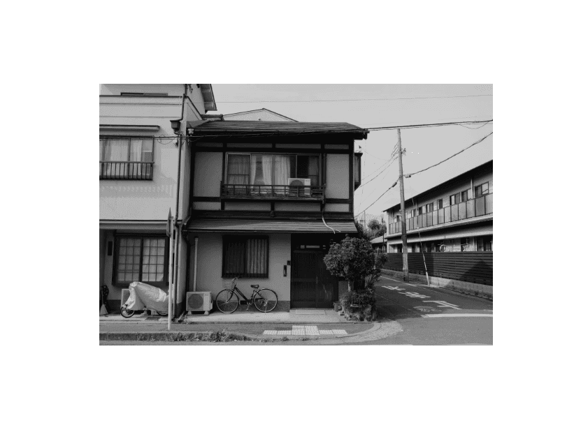
An elegant image effect where the image starts in grayscale and transitions to full colour on hover. Ideal for portfolios, product previews, and gallery sections, this component adds a smooth, modern touch to your visuals. It’s fully responsive and easy to customise. You can control the grayscale intensity and hover duration to fit your brand style. Fully compatible with Systeme.io’s custom code blocks.
image hover scale
image hover scale
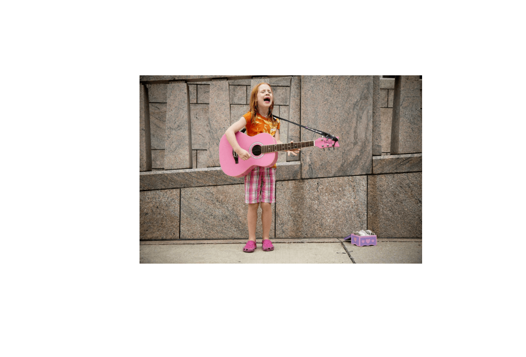
A clean and interactive image component that gently scales up on hover, adding a subtle zoom effect. Perfect for galleries, product showcases, testimonials, or featured sections—this component adds visual depth and engagement with minimal code. Built using HTML, CSS, and JavaScript, it's fully responsive and works seamlessly inside Systeme.io. You can customise the scale intensity, transition speed, and border radius to match your design.
gradient text
gradient text
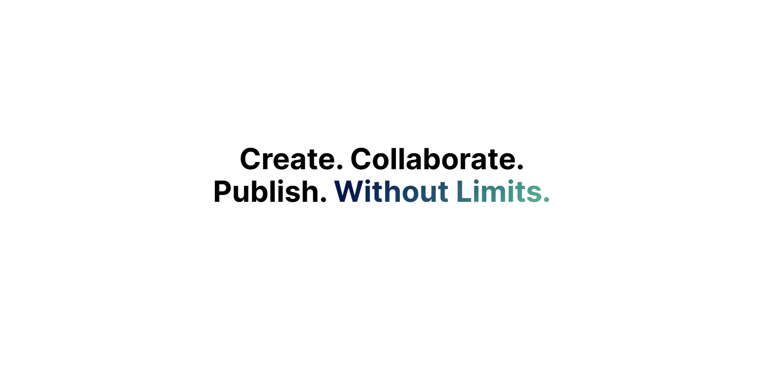
A vibrant and modern text style where the lettering displays a smooth blend of multiple colours. Ideal for headlines, banners, or attention-grabbing sections, this effect adds a colourful, premium feel to your content. It helps key messages stand out and adds a creative flair to any page. Easily customizable to match your brand's colour palette, and works seamlessly within Systeme.io.
gradient button
gradient button
A sleek, eye-catching call-to-action button with a vibrant gradient background. Perfect for sales pages, funnels, and lead capture forms, this button is designed to stand out and encourage users to click. Fully customizable with CSS —easily tweak the gradient colours to match your brand. Works seamlessly inside Systeme.io using the custom code block. You can find various lush gradients on the tools page.
button hover grow
button hover grow
A simple yet effective button that gently grows in size when hovered over, creating a subtle zoom effect that draws user attention. This micro-interaction adds a modern, responsive feel to your call-to-actions, making them feel more interactive and clickable. The scale animation is smooth and fully customizable—you can control the grow intensity, speed, and easing to match your design language. Built with HTML and CSS using transform: scale() and transition, this component is lightweight, fast, and works seamlessly within Systeme.io using a custom code block.
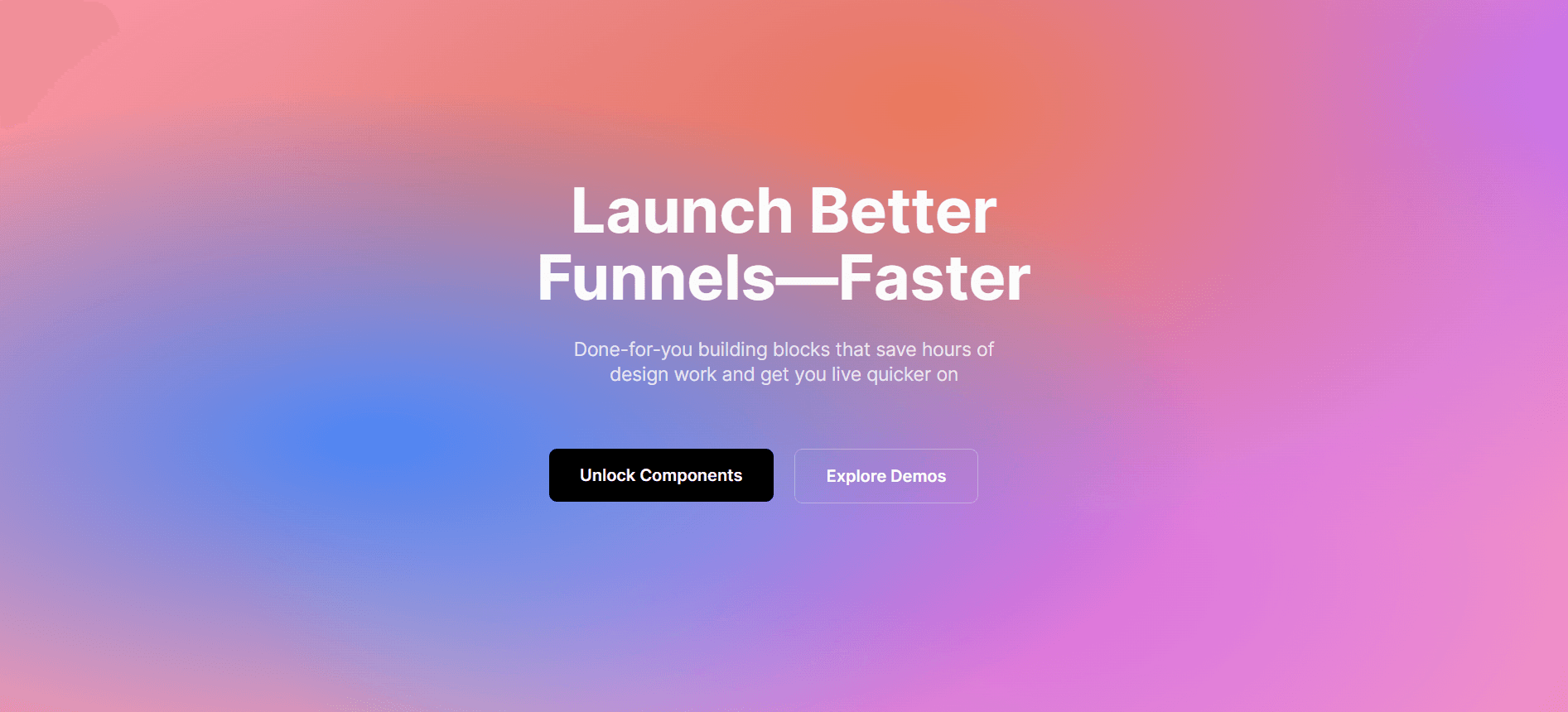
mesh gradient background
A modern, organic background made with overlapping mesh gradients that create a soft, colourful, and abstract visual effect. Ideal for hero sections, landing pages, or full-page backgrounds, this component adds depth and visual interest without overwhelming your content. Built with HTML and CSS, the mesh gradient is fully customizable—adjust colours, blur levels, shapes, and positioning to match your aesthetic. Seamlessly integrates into Systeme.io using a custom code block, giving your pages a premium, design-forward look.
animated gradient background
A vibrant and visually engaging background with a continuously moving gradient that creates a sense of depth and energy. This effect is perfect for hero sections, landing pages, or attention-grabbing banners. Built using HTML and CSS keyframe animations, the gradient smoothly transitions across multiple colours and directions to keep your page feeling dynamic and modern. Fully customizable — you can change the gradient colours, animation speed, direction, and intensity. This component integrates easily into Systeme.io using a custom code block and pairs well with centred headlines, buttons, or frosted glass overlays for maximum impact.
animated gradient text
A bold and stylish text effect where the gradient moves across the text, creating a vibrant, animated visual that's perfect for headings, hero sections, or standout callouts. This component brings your typography to life using pure HTML and CSS with no JavaScript required. The animation can be customised to loop, pulse, or move in any direction, and the gradient colours are fully adjustable to match your brand or theme. Best used on large, bold text for maximum impact, this animated gradient text integrates seamlessly into Systeme.io via a custom code block, giving your pages a polished, high-end look.
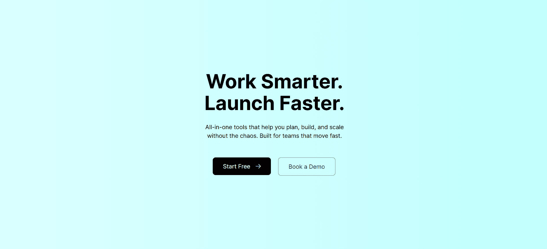
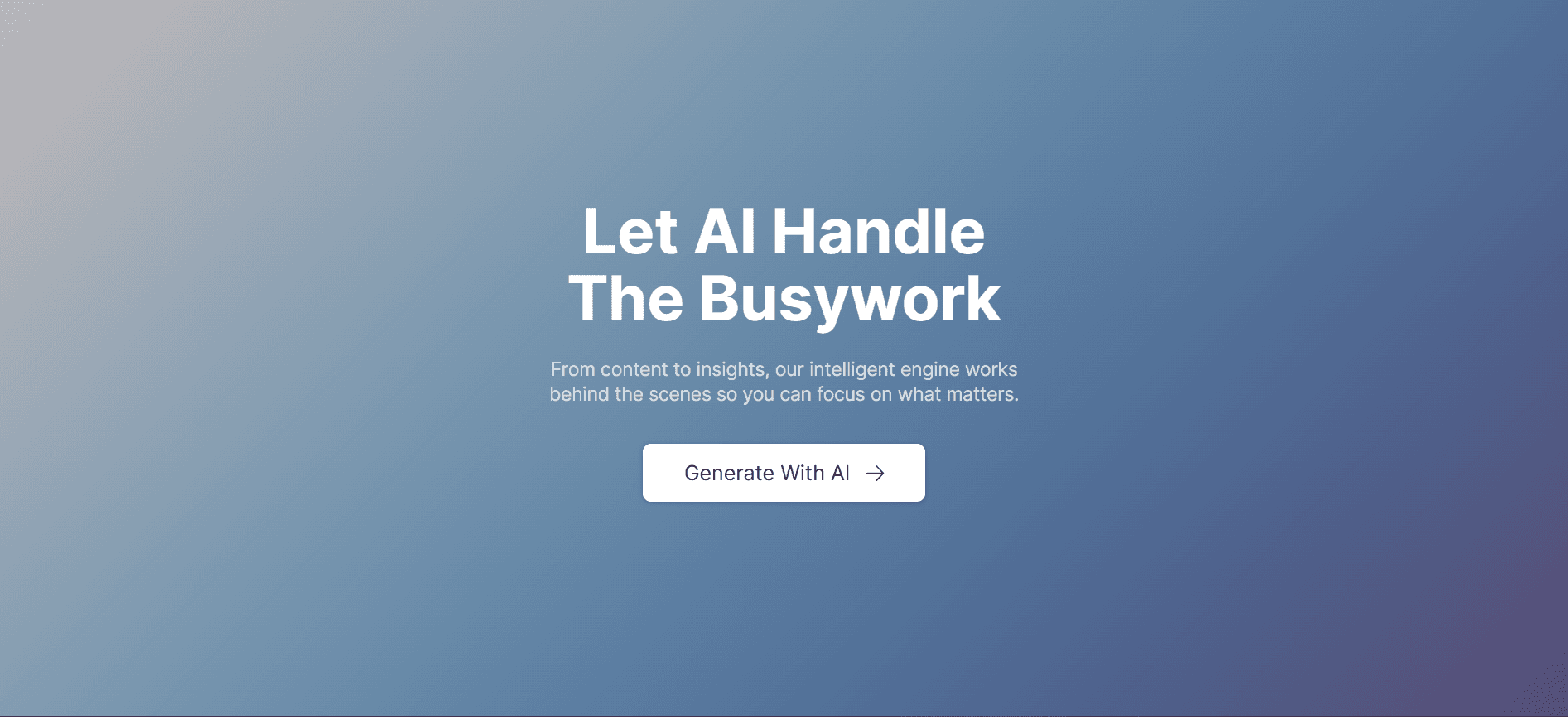
Gradient Background
Gradient Background
A vibrant and visually engaging static gradient background that adds depth and sophistication to your design. Ideal for hero sections, landing pages, or attention-grabbing banners, this background enhances visual appeal without the distraction of motion. Fully customizable — you can adjust the gradient colours, angle, and intensity to match your brand. This component integrates seamlessly into Systeme.io using a custom code block and pairs beautifully with centred headlines, bold CTA buttons, or frosted glass overlays for a modern and polished look.
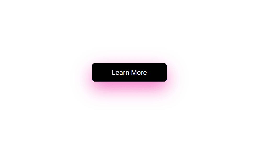
button box shadow
button box shadow
Add depth and dimension to your buttons with this subtle yet powerful box shadow effect. This component enhances the visual hierarchy of your design by making buttons pop against the background — improving both aesthetics and usability. Perfect for drawing attention to calls to action in your Systeme.io funnels.

Get Instant Access.

Access all 20+ custom-built components designed exclusively for Systeme.io. Start optimizing your pages and boosting conversions today.